By definition, a poster is any piece of printed-paper designed and attached to a wall or vertical surface. Typically posters include both textual and graphic elements. They have been around in some form since the days of William Shakespeare advertising his latest play. Posters, in many cases, are designed to appeal not only to the eye, but also as a way of conveying information in a quick, efficient manner.
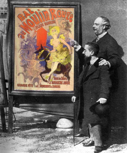
Jules Chéret with Henri de Toulouse-Lautrec
Photo: PD-US
The birth of the modern poster can be traced back to 1870 when the printing industry perfected color lithography. Chromolithography followed lithography and allowed for the mass printing of posters in vibrant colors. This technique spread throughout Europe and by the 1890s a number of noted French artists including Toulouse-Lautrec, known for his poster art and Chéret, who is considered the “father” of advertisement placards brought posters to a new level. The widespread use of posters, particularly in Paris, transformed the streets into public art galleries. This art form took a much longer time to evolve in the United States.
For quite awhile, posters in the United States were utilitarian in nature and only provided basic information. It wasn’t until traveling circuses became popular did posters become colorful. They started to evolve into more of an art form beginning in the 1920s when they started to promote war efforts and recruitment, world’s fairs, and exhibitions. The film industry quickly realized that colorful posters were a great way to advertise and sell their movies to the public. They gave audiences a taste of what the film was about.
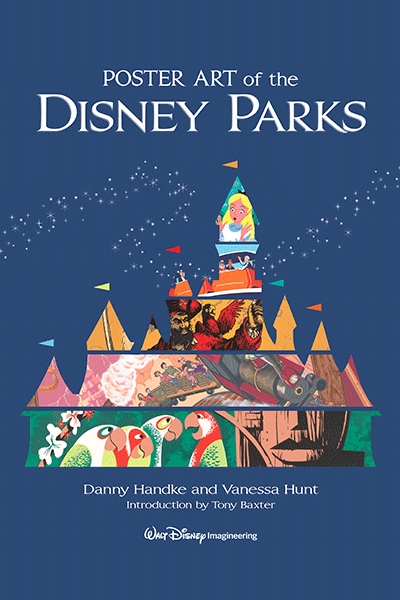
Book Jacket Cover
Image: The Walt Disney Company / Disney Editions
In the introduction to “Poster Art of the Disney Parks” written by Danny Handke and Vanessa Hunt, Tony Baxter says, “A great poster sells its story from a distance and needs to be glimpsed just briefly to work its magic. Great illustrations… often tell complex stories within the imagery.”
Walt Disney, who was not only a master storyteller, but was also keenly aware of what people wanted and what would make them happy. So when he set out to build Disneyland, he wanted to present the park just as if he was producing a motion picture.
Arriving at Disneyland was planned in the same manner as if someone were going to see a movie. One of the first things that guests would see at a movie theatre is a poster promoting either current or future movies. At Disneyland, as guests pass through the tunnels, under the train station, attraction posters line the walls on either side giving guests a taste of what will soon come.
Handke and Hunt’s book acts in a very similar way. Readers get a concise, detailed overview of the history and evolution of Disney Parks attraction posters. Then there is not only a sampling of attraction posters, but there is also a beautifully illustrated, step-by-step description of The Imagineering Guide to Screen Printing using a 1978 Walt Disney World Monorail System poster.
Image: Poster Art of the Disney Parks Book
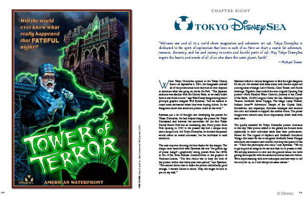
The authors then divide up the posters according to each of the lands in the various Disney Theme Parks, as well as Tokyo DisneySea and Disney California Adventure Parks.
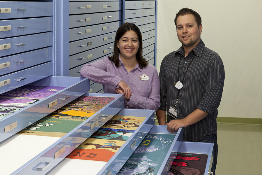
Vanessa Hunt and Danny Handke / Walt Disney Imagineering
Photo: The Walt Disney’s Company
Danny Handke, who has been with The Walt Disney Company for almost ten years, is an Associate Show Producer for the Creative Division at Walt Disney Imagineering. He works on projects for the Tokyo Disney Resort, Hong Kong Disneyland, and the Disney Cruise Line Portfolios.
Vanessa Hunt has worked for The Walt Disney Company for almost eleven years and is currently part of the team in the Walt Disney Imagineering Art Library. This team has the monumental task of being responsible for close to 110,000 pieces of Imagineering created artwork.
Both big fans of the attraction posters in the Disney Parks, Vanessa and Danny were discussing Disney books one day and he said to her that he would love to develop an attraction poster book that had every poster from every park worldwide in one place. Vanessa thought the idea was fantastic and suggested it should be a legitimate “art of” coffee table book. After discussing the idea with Jeff Kurtti, a former Disney Imagineer and Disney Historian, he helped them pitch the concept to Disney Editions.
The narrative for the book, which is predominately found at the beginning of each chapter, sets up each chapter.
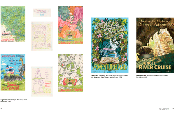
Versions of The Jungle Cruise Attraction Poster
Image: Poster Art of the Disney Parks Book
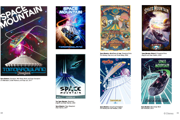
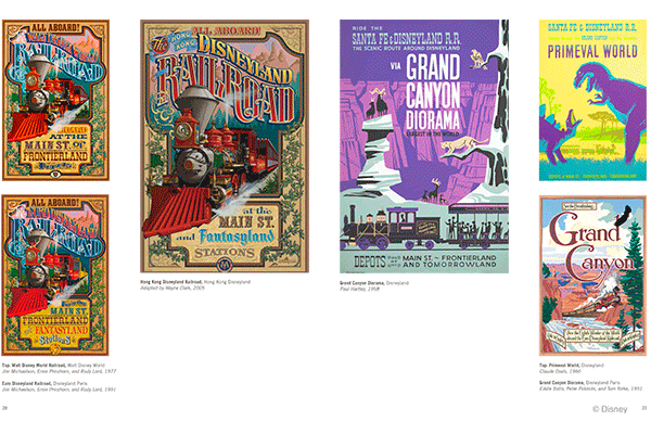
Vanessa says they initially discussed laying out the book decade by decade, but it made a lot more sense to go by Land. It was Danny’s idea to lay the book out in the same way you would walk around the Magic Kingdom. “This way you get to see all versions of say, the Swiss Family Treehouse poster on a single page spread,” says Hunt. “It makes for a pretty stunning at-a-glance evolution of that (and many other) attraction posters.” Handke adds, “Laying out the book by land had a btter flow than laying it out chronologically or by park. I think we always had in mind that Chapter One would be about the history and the people, and then the unique secondary parks – Tokyo DisneySea and Disney California Adventure – would be at the end of the book”
Before the era of computers, creating and printing posters were a laborious process. Danny says that Greg Paul, who is a Walt Disney Imagineering specialty design director, told him that some of the Disney Park posters could take a month to create and cost upwards of $30,000. “In the 1980s and 1990s, Imagineers pushed the envelope in poster design, some of the posters were screen printed with over sixty colors, which took a tremendous amount of labor hours to produce,” says Handke. “The Disneyland Paris posters are great examples of the most complicated designs.”
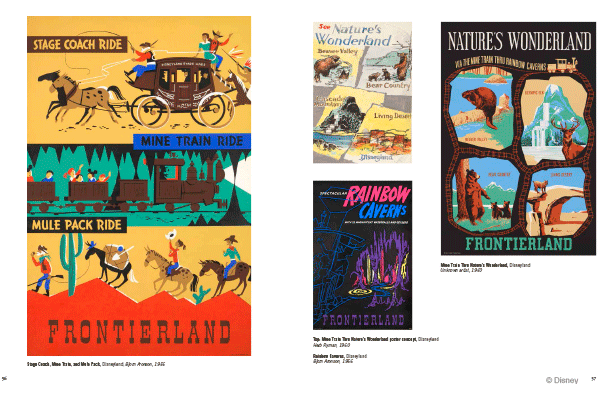
Some examples of Disneyland Posters including art by Bjorn Aronson
Image: Poster Art of the Disney Parks Book
“We don’t have a lot of information on how the artists or Imagineers were chosen to create the early attraction posters,” says Hunt. “But Bjorn Aronson had designed posters before, so perhaps Walt chose him to do most of the original posters.” In the mid-60s, there was a screen-printing shop at Imagineering. Hunt said that the Graphic Designers would design the posters and the screen-shop would print them.
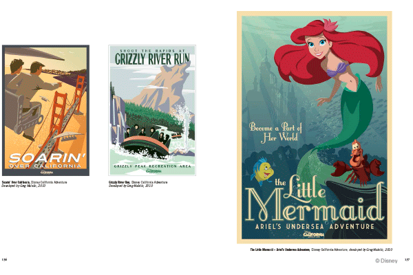 Image: Poster Art of the Disney Parks Book
Today, the process varies. Hunt said that some of the posters are created by the Graphics Department, concept designers on that particular Team do some, and some are done by outside artists. The posters that were created for the new Disney California Adventure attraction posters are a good example of this. Handke adds, “Today, it is the discretion of a project’s Created Director who designs the posters. And for most modern projects it is a collaborative effort between the Creative and Graphics departments.”
The book took four years to compile and although not every poster or every park is represented the ones that were included are a good example from most of the Parks.
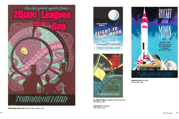
“I believe we have practically every attraction poster represented in the book,” says Handke. “However, there are some exceptions. Based on our research, we decided not to include the posters from some of the secondary parks, such as Epcot and Disney’s Animal Kingdom. We do refer to these parks and explain their posters in the first chapter.”
Image: Poster Art of the Disney Parks Book
Among those posters that were excluded are some that had modified versions of previous posters. For example, the Satellite View of America poster, which did not make it into the book, has the same background art as the Space Station X-1 poster, just with a different logo. “Although, we tried to include as many of these “poster variations” as possible,” says Handke.
For both Handke and Hunt, the most challenging part of putting this book together was time. “Curating close to 300 pieces of artwork was a huge challenge,” says Hunt. “Not only was I on designer duty, but I also had to do my usual Art Library duties: Getting image approvals, having Jess Allen (our WDI Photographer) re-scan art, digitally cleaning files with the help of my fellow Art Library team, and ensuring the colors printed accurately.” She adds, “This was a massive project and there are only four of us in the Art Library all working on other projects at the same time!”
Image: Poster Art of the Disney Parks Book
Each page of this book pops with color. Because they started with a high resolution, color accurate scan of the original silk-screened poster, the color reproductions of these posters are as close to 100% accurate as possible. Because Disney custom-mixed all their colors some of them just can’t be reproduced. However, the accuracy of these posters were a result of starting with a high resolution, color accurate scan of the original silk-screened poster. They re-scanned about 80 of them for the book. Hunt said, “Everyone in the Art Library looked at the proofs.” Hunt said that between the four of them (in the Art Library) they all looked at the original posters many times over the years, so they each flagged posters that they felt didn’t look very accurate. Mike Jusko, WDI Principal Art Archivist, and Hunt went into the vault, pulled the original silk-screened posters and Pantone matches them as closely as they could get. They ended up doing three sets of proofs, but because there isn’t always an exact Pantone match, they needed to get the printer in the right ballpark. However, the final book is very accurate.
The authors are all for a second edition of the book, but only when the timing is right and there is enough material to warrant an update.
The WDI Art Library frequently has original artwork on exhibition such as the Peter Ellenshaw Disneyland painting, as well as four Mary Blair “it’s a small world” pieces on display at MoMA – this is part of their Century of the Child exhibit. At Disney, there has been discussion about mounting a specific attraction poster exhibition, but there are no plans currently in the works for this.
Image: Poster Art of the Disney Parks Book
Picking a favorite poster from the book is almost an impossible task. You may like the graphics in one poster, the colors of another, the lettering in another, and the attraction itself in another. Whenever Handke and Hunt are asked what their favorite poster is in the book, it’s the same agonizing question for them to answer. Hunt says that although she loves them all, the Grand Canyon Diorama grabs her attention. She also loves the train design. She says, “The color palette is amazing!” Although the Mr. Toad’s Wild Ride poster is one of Handke’s favorites he says it’s always hard to choose just one. “I have favorite posters from every park and every decade,” says Handke. “One of my top favorites is the 1958 Sam McKim poster for Alice in Wonderland at Disneyland. The colors and composition are exquisite.” Handke says that what makes this a great attraction poster is it’s easy to read from a distance, but when you get close to it, the poster is rich in detail and offers an explanation of the attraction’s story and experience. In the end, that is exactly the job of a poster.
“Poster Art of the Disney Parks” is currently available for sale at Disney Parks and online. Suggested retail price: $40.00.
References:
Interview with Danny Handke and Vanessa Hunt
Handke, H, Hunt, V., 2012, Poster Art of the Disney Parks, Disney Editions
Wikipedia
www.historyofposter.com
Leave a Reply